 |
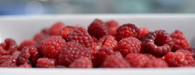
Freshly Picked
copyright 2013, Stephanie Maatta |
This week my photography group was asked to look through our own photos and find the similarities and elements we saw connecting our images together, and explore what these elements suggest about our "eye." In some ways this was easy for me; in others distinctly difficult. And, one of the most difficult parts was selecting images to include in my Inspiration File.
Color
 |
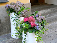
Street Florals in Helsinki
copyright 2012, Stephanie Maatta |
 |
Bee Yellow
copyright 2013, Stephanie Maatta |
The images that seem to attract and inspire me the most have pops of color throughout them. The flowers in "Street Florals in Helsinki," especially the bright pink, caught my eye in the contrast between the pink, lavender and green of the floral displays and the gray of the street bricks and stairs. The image is set off by the buttery yellow wall behind. "Bee Yellow" focuses on the yellow of the flowers echoed in the yellow of the bees. As I look through my Inspiration File, I see vivd blue and orange, many shades of green, and juicy reds, like the "Freshly Picked" raspberries. I suspect my focus on color comes from some of my other creative endeavors, especially needlework. The patterns and fibers I choose have similar properties to the images that inspire me.
This isn't to say that I don't appreciate monochromatic or black & white photography. I deeply appreciate the beauty of
Clyde Butcher's Florida and the work of
Ansel Adams.
Texture
 |
Shadows on Bark
copyright 2013, Stephanie Maatta |
 |
Birds in Hand
copyright 2013, Stephanie Maatta |
Many of my images have a strong textural component in them, inviting me to touch them. "Shadows on Bark" intrigues me with the play of the shadow against the tree, and the smoothness of the shadow cast against the roughness of the bark. What I love about "Birds in Hand" is the detail in the texture. The hand appears natural and the birds would be life size wrens if they were real. Much of the statuary at
Dow Museum of Historic Homes appears to be made from either cast concrete or coquina, but worn from weather and salt air. I also see traces of color in both images -- the copper bark in "Shadows on Bark" and green foliage in "Birds in Hand."
Perspective
 |
Mr. Henry's Hounds
copyright 2013, Stephanie Maatta |
 |
Mr. Henry's Hounds
copyright 2013, Stephanie Maatta |
One thing that I find fun about many of my images is the perspective. The photos were made at unusual angles without a front-on, direct point of view. "Mr. Henry's Hounds" is a particular favorite. Looking straight on, the hounds could be a statue of any pair of dogs -- nice but not stunning. But shooting the image from below gives the hounds a new perspective that feels as if they're standing at point looking for Henry. The second image also captures the essence of the place where the statue is located.


I'm glad you worked through your images to find these elements of your style. I enjoyed reading that you find a similar elements in your needlework. I find that these types of stylistic elements often transcend the medium we work in. They are just part of who we are. Wonderful entry! I look forward to seeing more from you.
ReplyDelete